Ebay Interface Redesign
This group project was based on redesigning an existing website to make it more user friendly. We chose eBay because of its cluttered and overwhelming UI. We broke down our redesign into three primary categories: navigation, product visuals, and checkout. My specific task was redesigning visuals and product pages.
Gokul Vipin: Navigation
Tessa McGarrity: Product Visuals
Conor Murcar: Checkout
UX/UI
Ebay’s interface had an outdated visual design that was overwhelming and left users frustrated when browsing to find products.
Problem:
Strategy:
Analysis of the target audience showed that users were looking for a more intuitive product display. They needed a site that demonstrated visual consistency across all pages, with a more modern and colorful look to keep them scrolling.
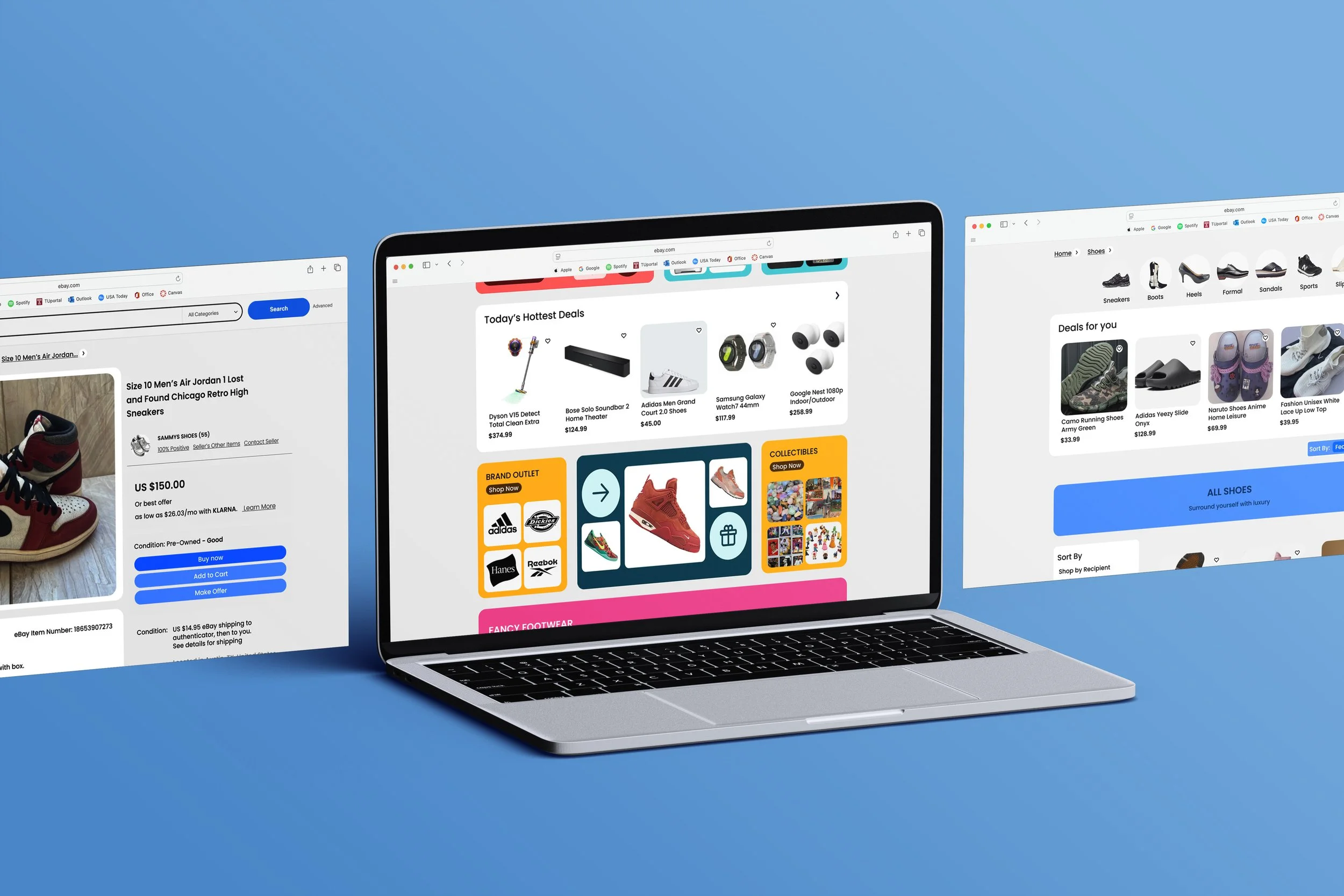
Final Page Vectors

We evaluated competing e-commerce sites in the market to understand what eBay was lacking and what they were doing well. We settled on five main competitors; Amazon, Mercari, Rakutan, Craigslist, and FaceBook Marketplace. We based this evaluation on features like filtering systems, storefront selling, reviewing products, and ads.
Competitive Analysis
To understand how to improve product visuals and the consumer viewing experience, I went straight to the survey to gather direct insight on people's thoughts regarding the interface. We included an open-ended question that said; "What advice would you give the eBay design team?"
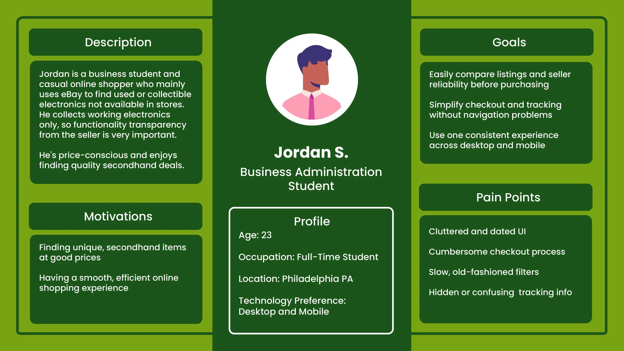
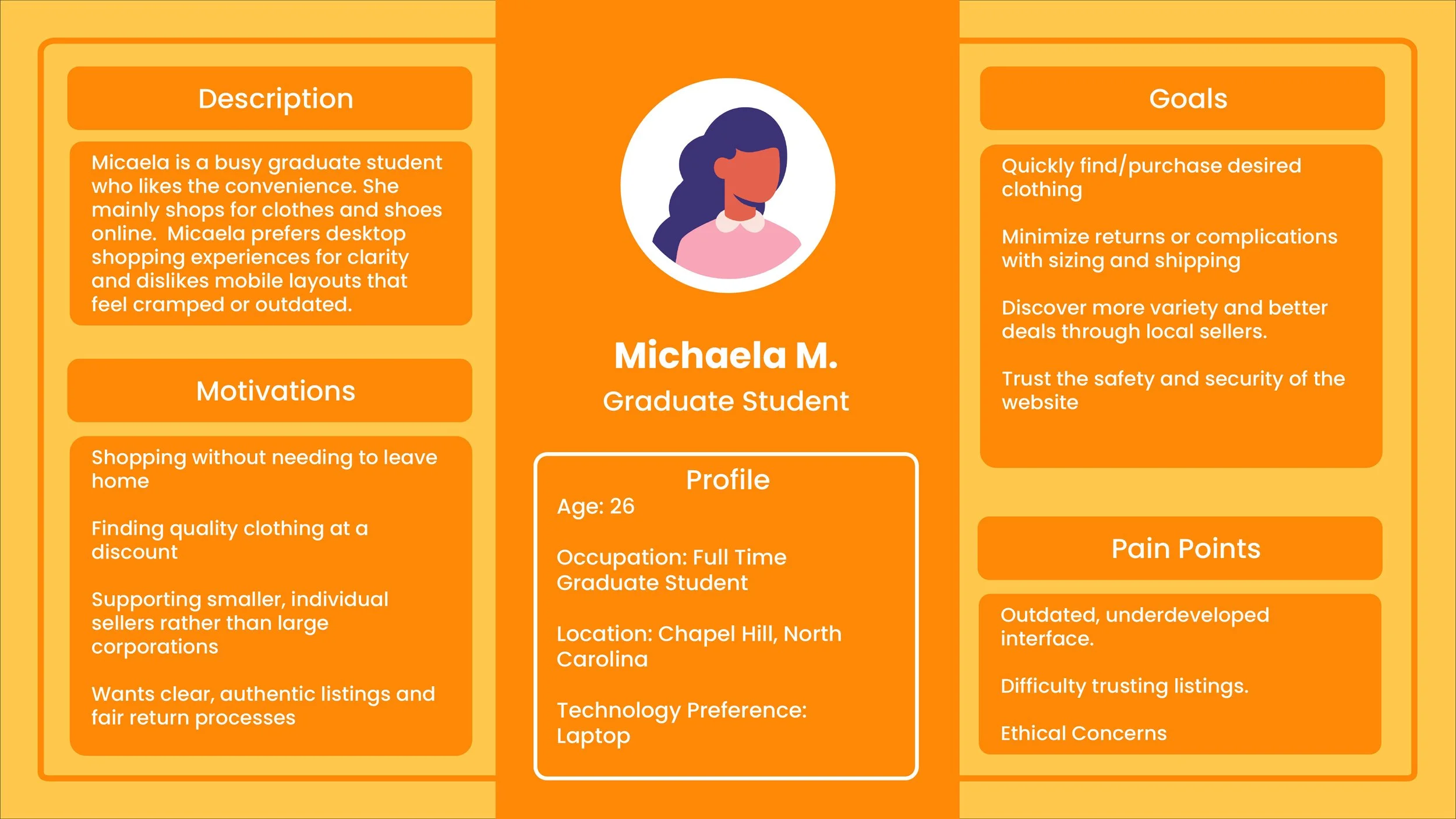
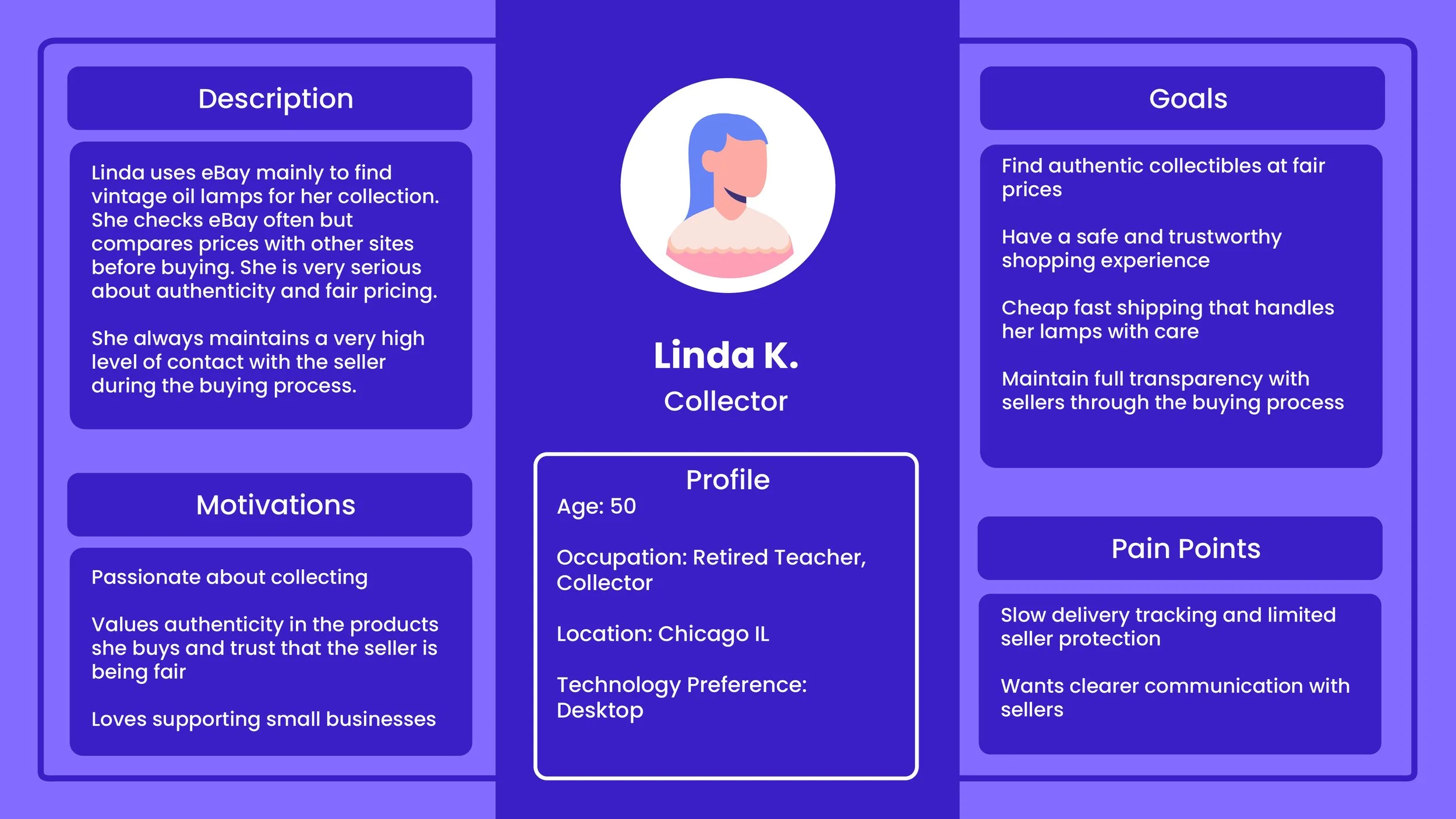
Through the survey feedback we created our user personas to help us better conceptualize what users are looking for in a new eBay interface.
User Survey
We focused on college students and young adults who regularly shop online
Users who browse eBay casually rather than professionally
People familiar with Amazon, Etsy, StockX, etc. (for comparison insights)
Participants with a mix of shopping habits
Occasional eBay users
Online shoppers who rarely use eBay (to understand barriers)
From the survey we concluded that the main issue with the UI of eBay was that it was cluttered and overwhelming to look at. Users had a hard time browsing for things without getting lost in endless scrolling down the page.
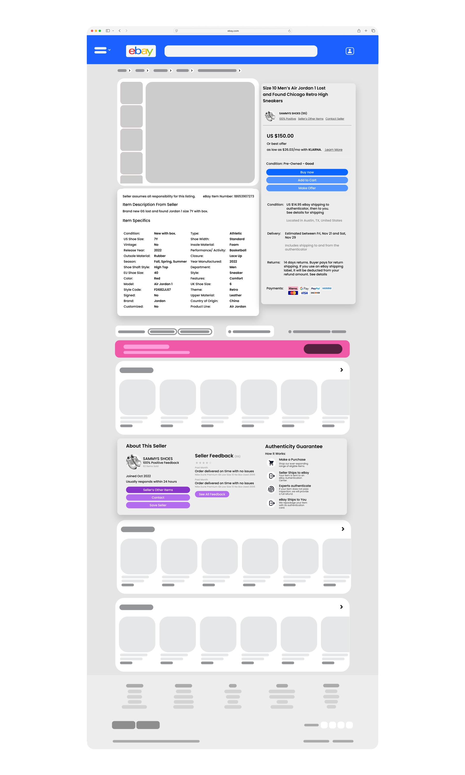
Another issue was the hierarchy of the information displayed. Especially in the product page when users were trying to find more information about the product they were considering buying. In the current eBay UI, users had to search for information like the manufacture year, and product material.
Survey Feedback
User Personas
Webflow
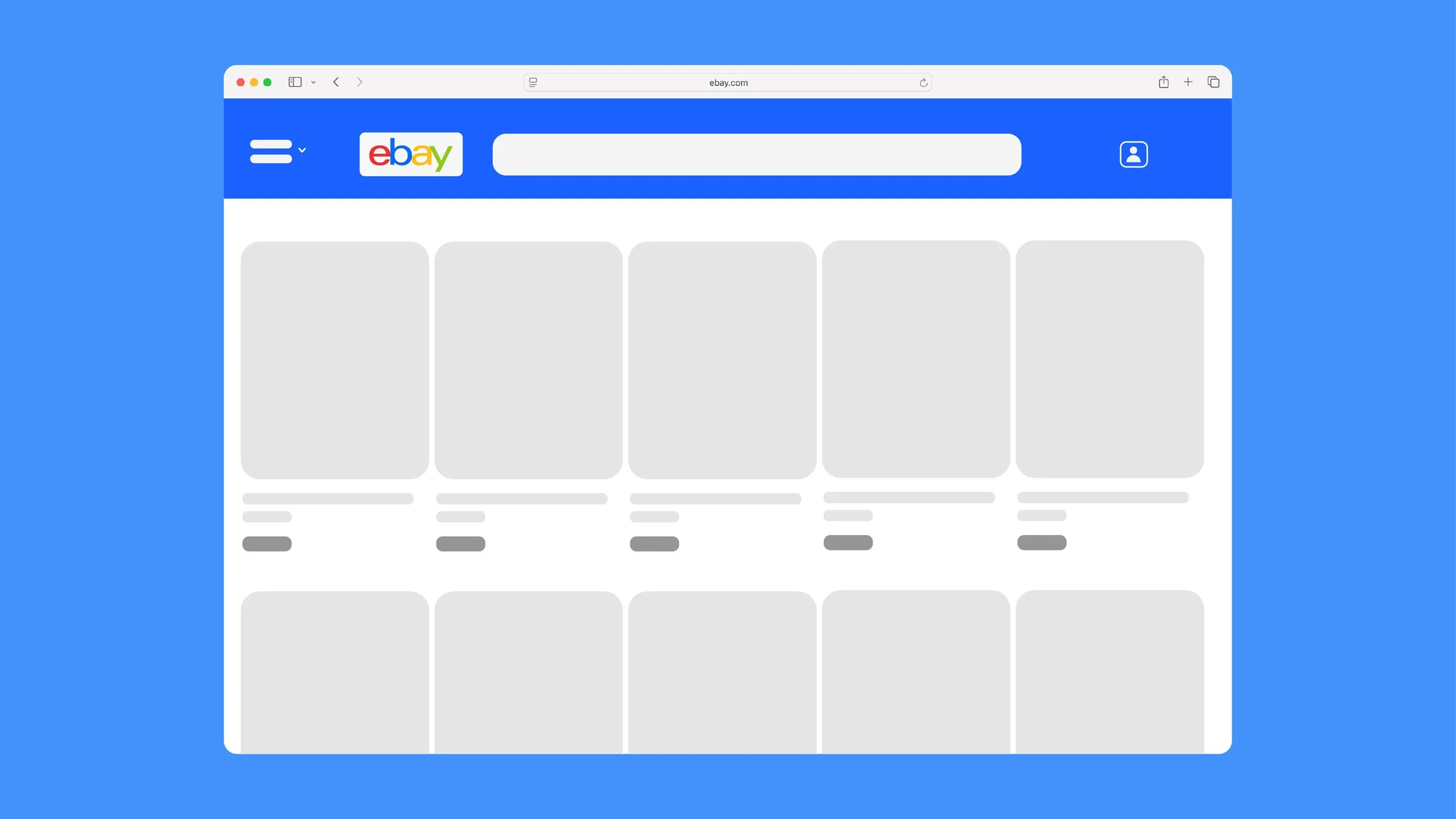
We decided to create a simple user flow to demonstrate how users go from browsing to buying a specific product. This specific flow shows a user starting at the home page, navigating to shoes category pages, and eventually landing on a pair of Jordan shoes. This web flow helped display the new bread-crumb feature added for navigation ease and also simplified our work for us to flush out exactly what needed to change visually for a better user experience.
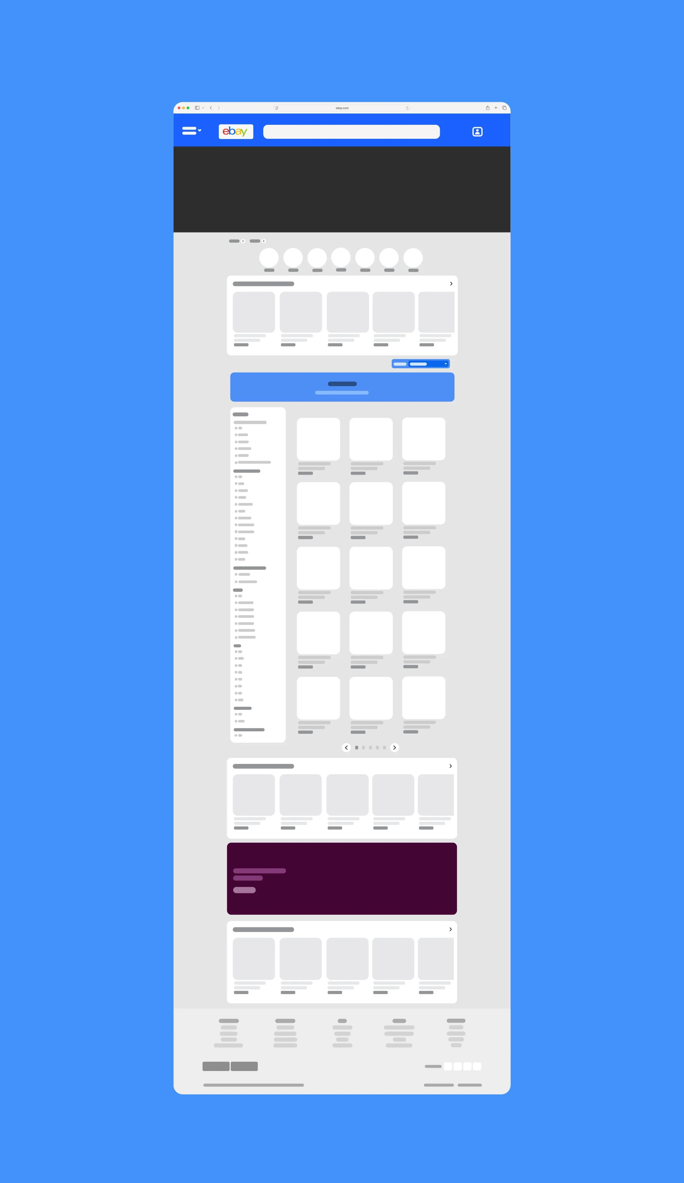
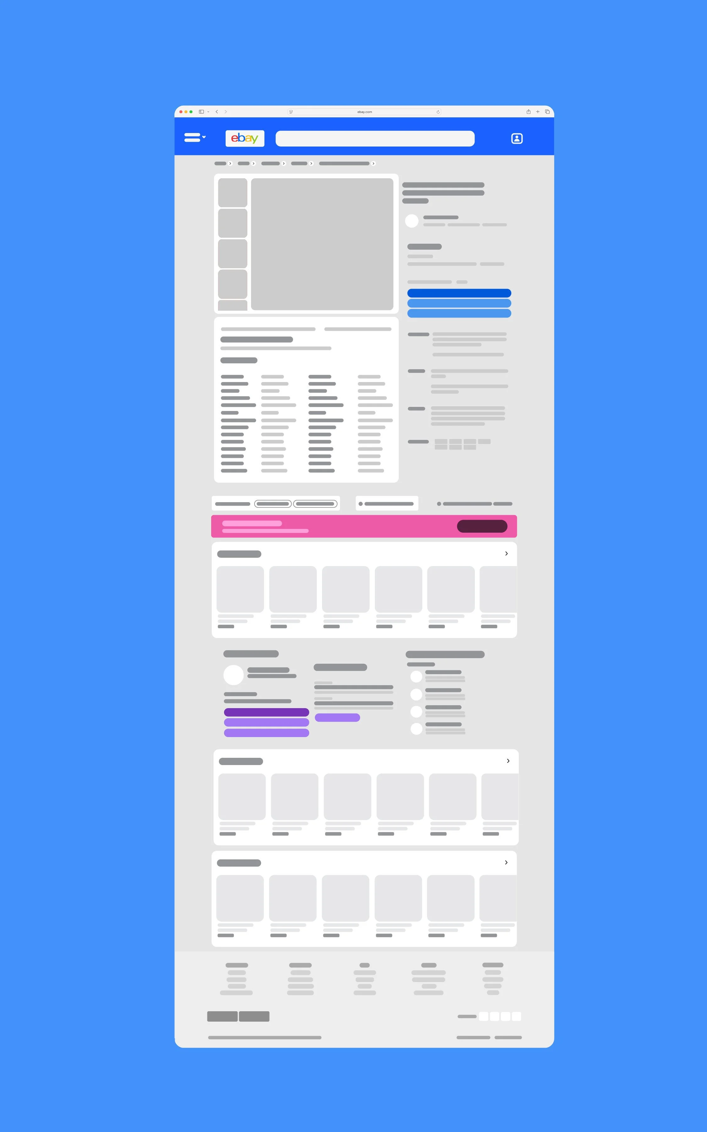
Ebay’s Current Interface

The large breakpoint presented a lot of white space. The space created an awkward layout in many spots of the site.
White Space
Some product tiles were different sizes than others for no apparent reason. In many parts of the site, only one carousel of products could be displayed in full at a time. This created more display problems and contributed to the overwhelming feel of the site.
Inconsistent Sizing
“How do you solve the "overwhelming" feel of the product viewing experience without sacrificing the feeling of 'endless options' that e-commerce sites capitalize on?”
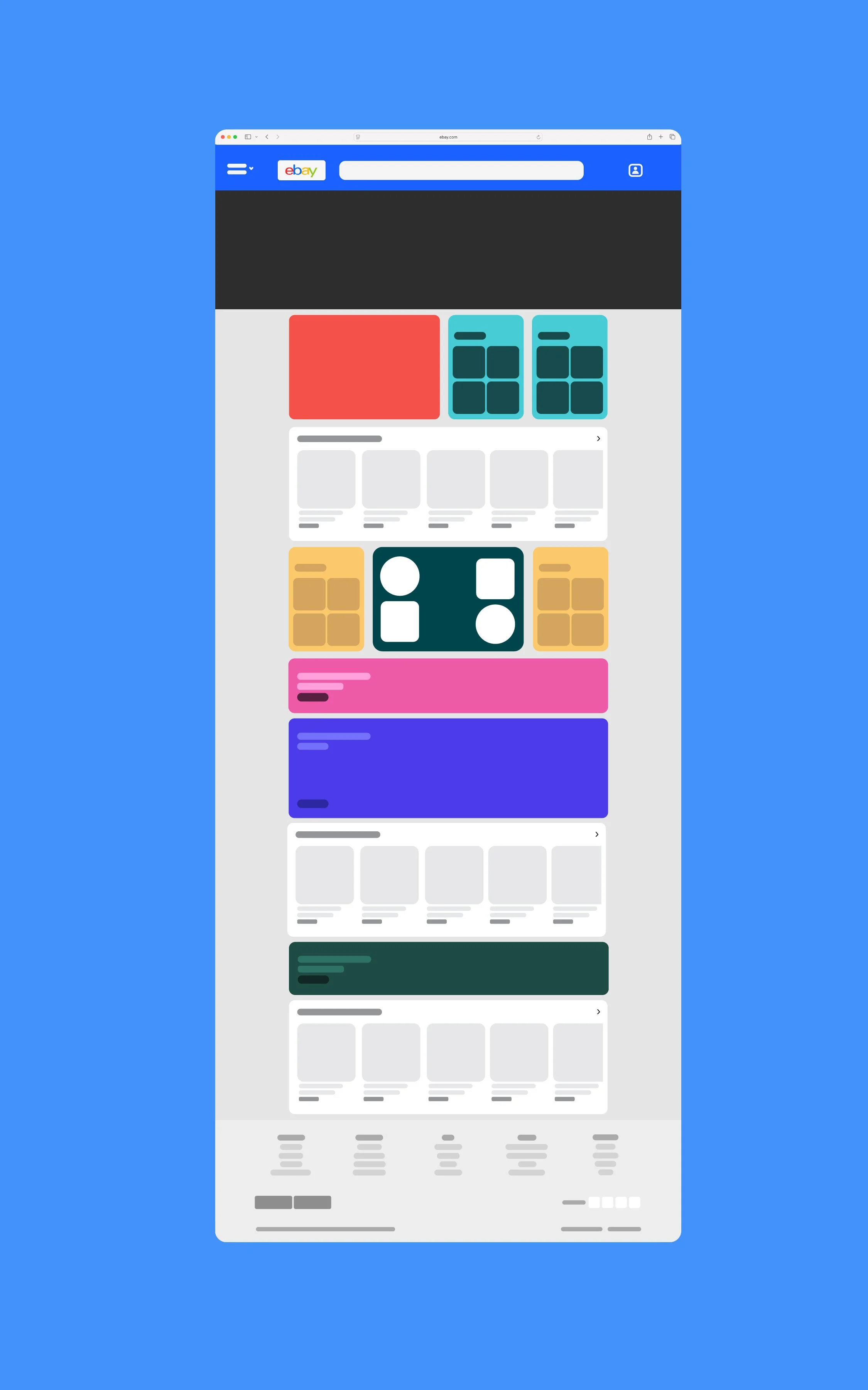
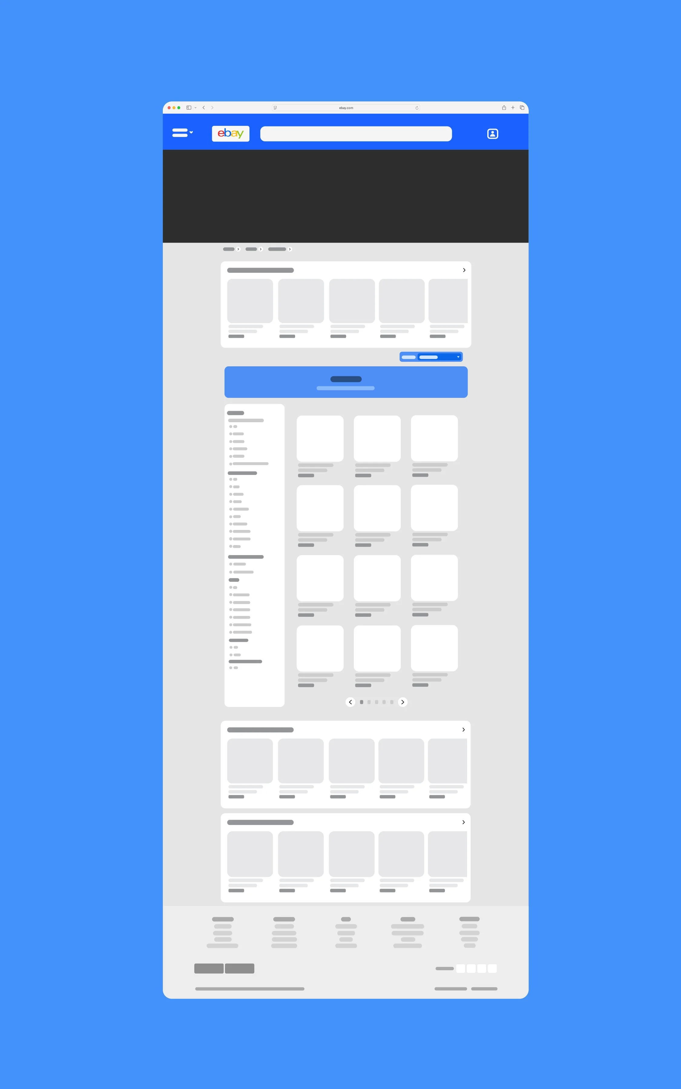
Ebay’s original breakpoint was very large which contributed to the overwhelming nature it gave off. I sized down the scale of the products which helped solve white space problems and overwhelming 'full scale' feel to the site. This allowed me to feature more products on one slider while also helping it feel more palletable for users.
Breakpoint
eBay was not intentional about how they displayed their important information in their checkout process. Viewers had to keep scrolling down to find item specific information and seller ratings. I reordered the checkout page to contain the most important information at the top, this helps users experience a quicker, more straight forward checkout.
Informational Hierarchy
Originally, eBay had many variable sizes for their products with no clear intention behind the different product scales. This made for a very unbalanced feel across the site and felt off putting for users. I made sure all aspects of the revised website were consistent through all pages; scale of product tiles, capitalization of letters, button size, category tiles, etc.
Consistency
Additional Features
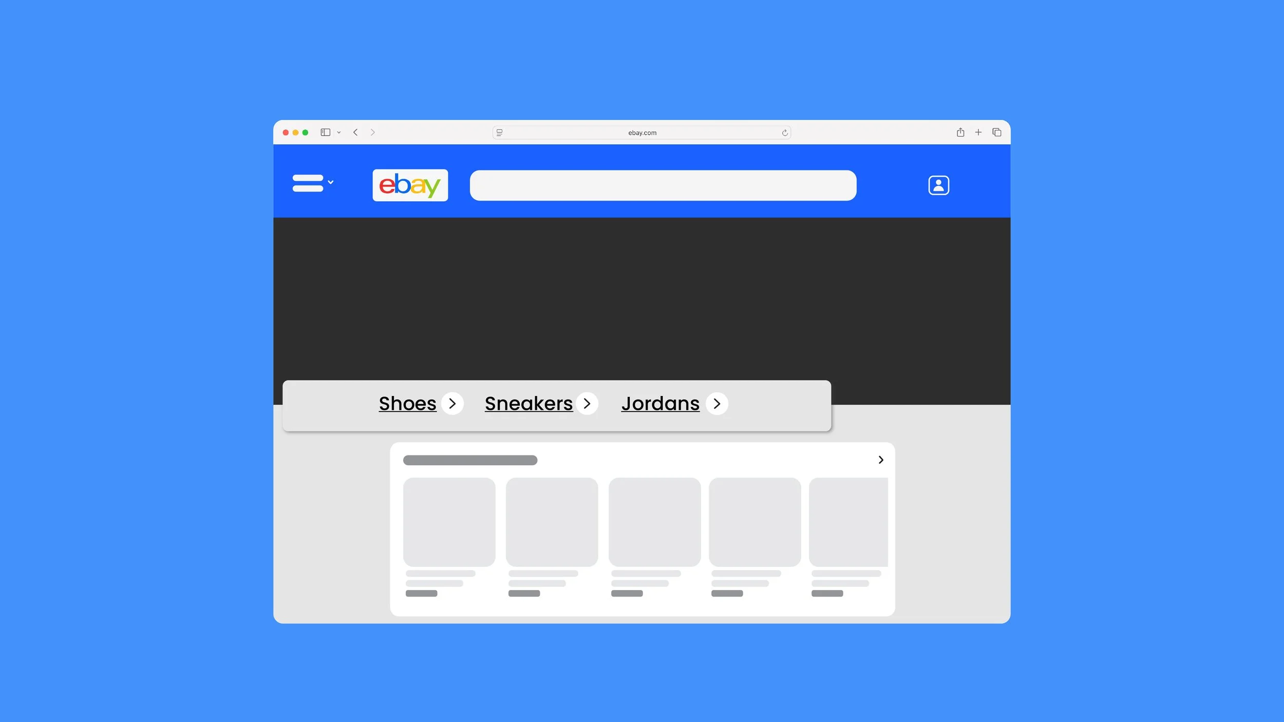
Breadcrumbing Feature
I created a typical breadcrumb feature that eBay originally lacked. This helped user flow immensely giving the ability to go back through pages when needed.
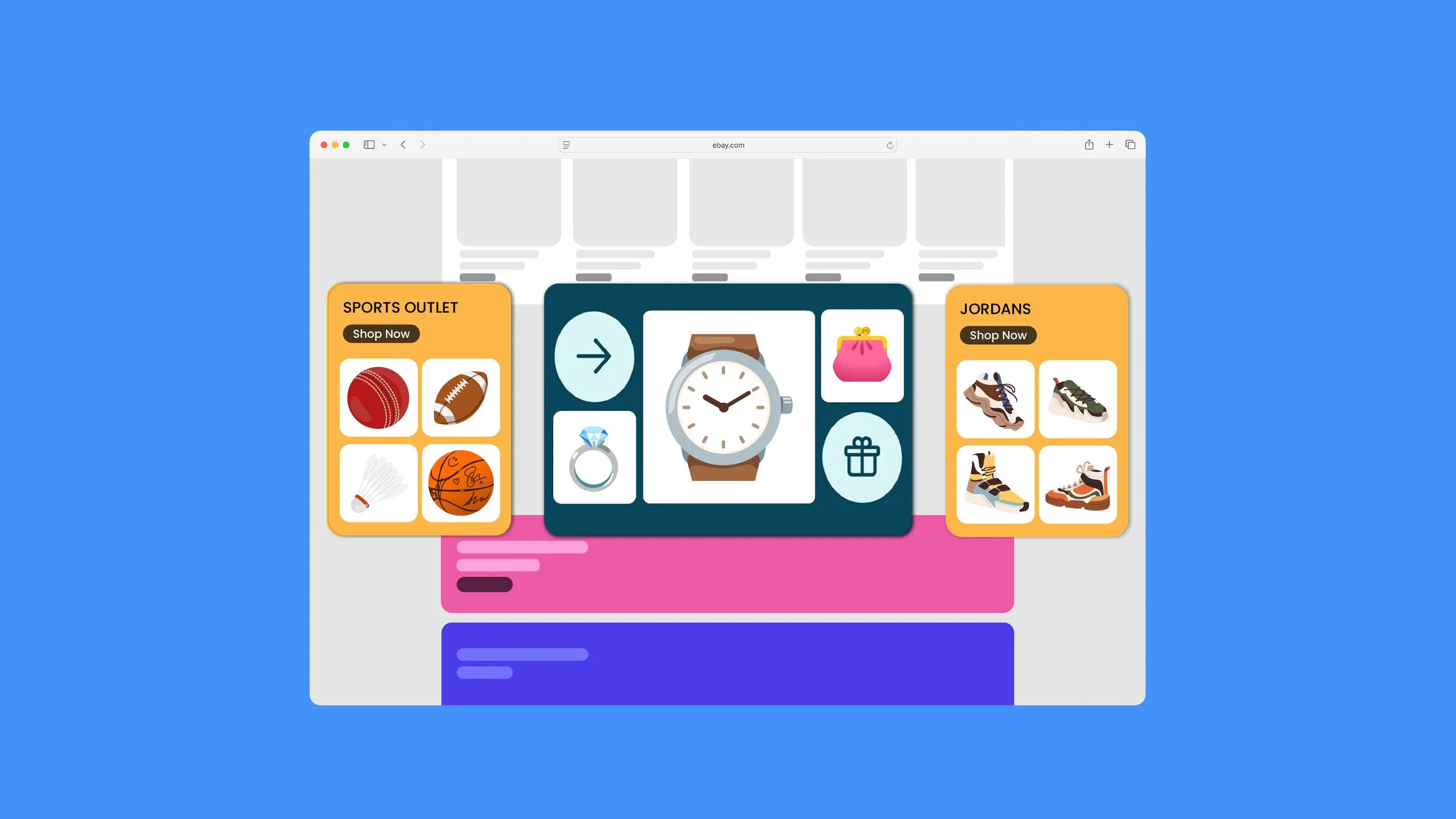
Category Cards
To better organize the homepage and make it less overwhelming, I created cards for popular categories of items people may want to buy. This helps the user effectively browse while also breaking up the space on the page.
Simplified Product Pages
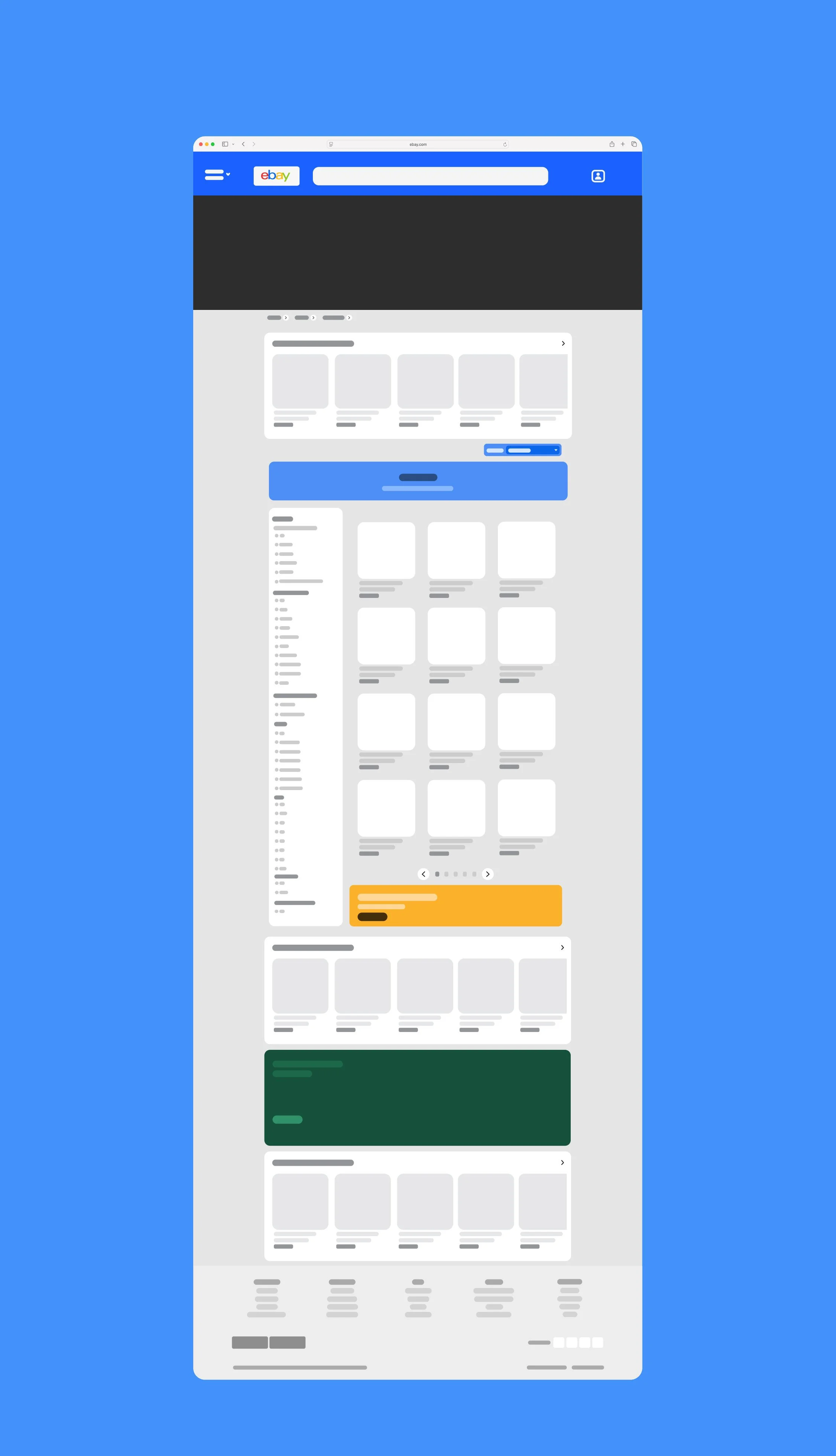
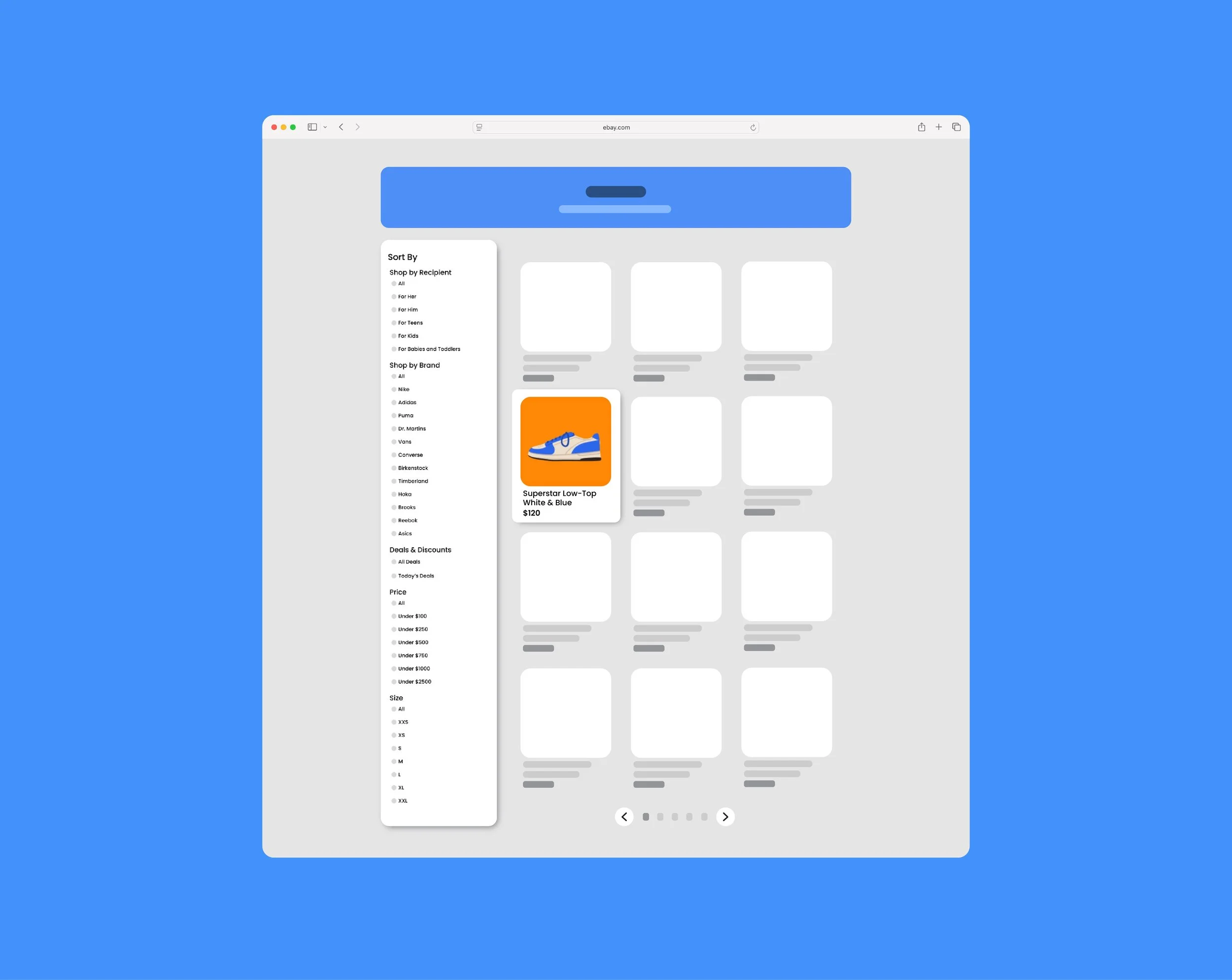
I also created a more simplified filtering system for users browsing. Instead of an endless scroll down a category page. Users are displayed twelve products at a time with pages to flip through and a side filter bar. This eliminates the overwhelming feel given off my too many visuals at once and makes the content more digestible.
We reimagined eBay’s UX/UI by transforming a cluttered, fragmented experience into one that feels modern, approachable, and intuitive. Through improved visual hierarchy and streamlined product pages, the redesign reduces friction and decision fatigue across the buying journey. These changes not only enhance usability for first time users but also preserve efficiency for experienced shoppers, proving that even long standing platforms can evolve through user centered design without losing their identity.
Tyler School of Art & Architecture, Temple University
Figma
Photoshop
Software Used:
Instructor:
Sara Hall